1 lesson on:

Typography Research
Lesson objective: To investigate the construction of Film Posters by developing knowledge of typography
|
To help you make wise decisions when creating your own film poster, it is important to spend time focussing on typography.
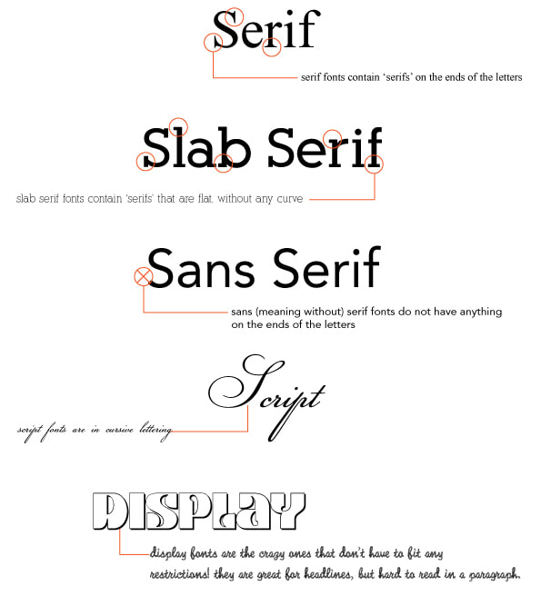
Task 1: Watch the video to learn more about film poster typography. Write down two or more points to add to your site about the use of typography in film posters. You might use some of the rules below - but summarise and write in your own words. |
|
|
Task 2:
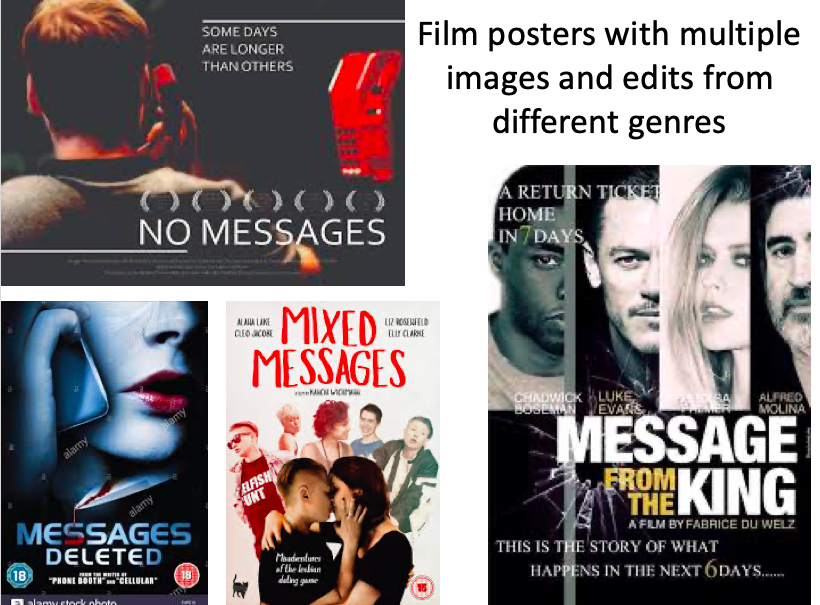
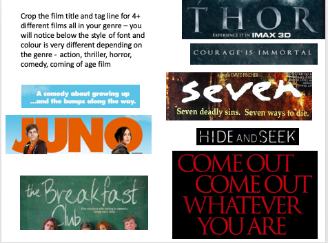
Green (grade 1-3) a) Add a new title to your site of 'Film Poster Typography Mood Board' b) Create a mood board of film titles and tag lines directly on to your site. Choose 6 horror films and crop the posters down so that all you can see is the typography in each image (see the mood board example below). Amber (grade 4-5) As above and annotate your mood board with common elements which you see in the typography: - Types of colours (e.g. bright primary and secondary, warm colours or dark, grey and blood red) - Style of fonts (e.g. serif - sophisticated or sans serif - bold big and fun) - Size of title compared to slogan - Use of capitals, lower case, mixed case or made to look hand written etc. Red (grades 6+) As above but write about why you think each of the decisions has been made in your annotations - what meaning does it add to the poster/how do the choices reflect the story of the film? |
|
|
The title Breakfast Club is written in chalk on a chalk board. The film is about teenagers at school and so the typography reflects the school location. The title 'Breakfast Club' is at odds with the school location as it makes it sound something fun for a group of elite characters. The word 'the' is small as it is not important to the whole meaning of the title. The slogan is small in comparison to the title and tucked underneath almost hiding. It is written in lower case sans serif font 'Five strangers with nothing in common except each other.' This slogan is interesting because it is small and unobtrusive and yet it it presents us with a dichotomy and makes the audience want to know more.
|
I like the idea of using the font within the photograph - I am going to try hand writing my title with the main character holding it on a placard.
|
|
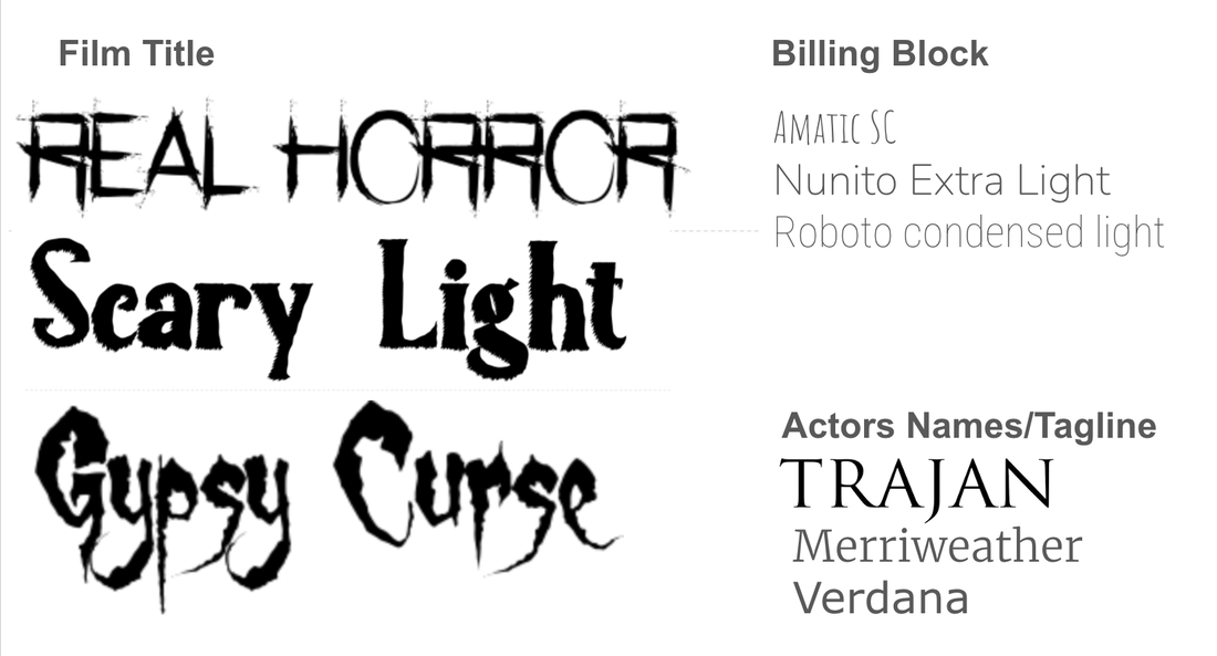
Task 3: Green (grade 1-3) Select at least 9 different fonts which you might like to use on your film poster from 1001fonts.com. Display them as a mood board either directly onto your site, or on PowerPoint. You should choose: - 3 fonts for the movie title (more exciting fonts) - 3 fonts for the billing block & director's names (ultra thin condensed typefaces - usually sans serif) - 3 fonts for the tagline & actor's names (plainer fonts) |
|
|
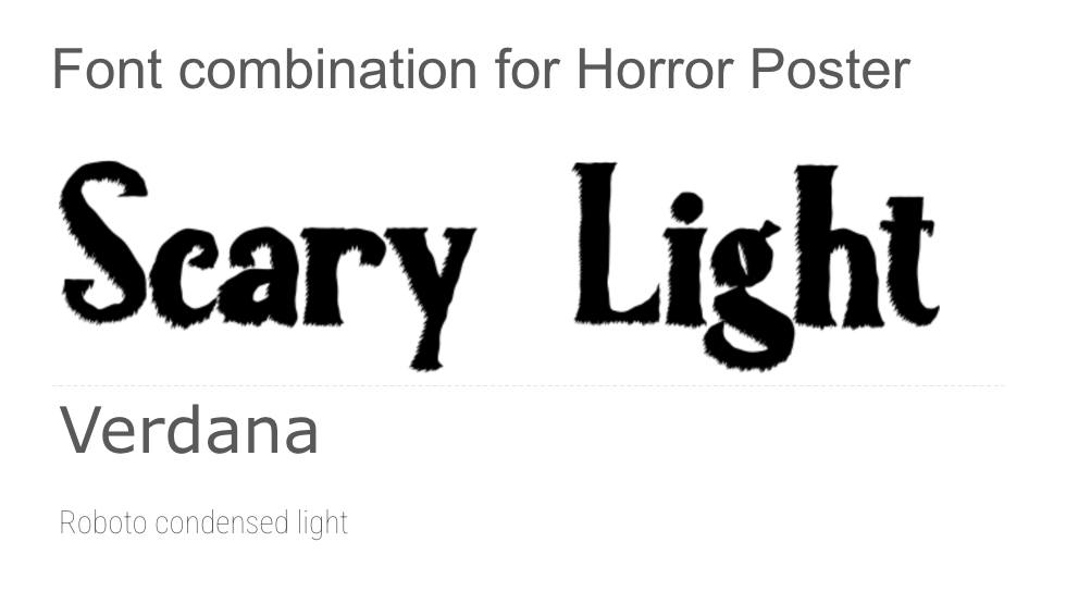
Task 4: a) Pick your three favourite fonts and display them together like I have in my example. Remember to look back at the 'common rules that designers use when they combine different fonts' before making your final decision. Title is large to give a suggestion of what the size would be like on the poster then the font for the actors names or tagline is medium sized and then the billing block is at the bottom smaller as it would appear on a film poster. |
|
