3 lessons on:

Typography & Layout research
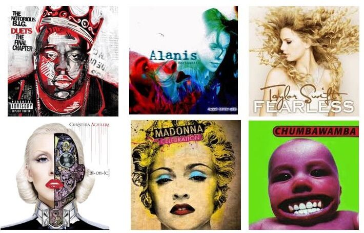
Lesson objective: To identify the types of typography and layouts used on CD covers and develop your own ideas

|

|

|
|
Green video - intro to serif and sans serif
|
Amber/red video - an overview of typography
|
|
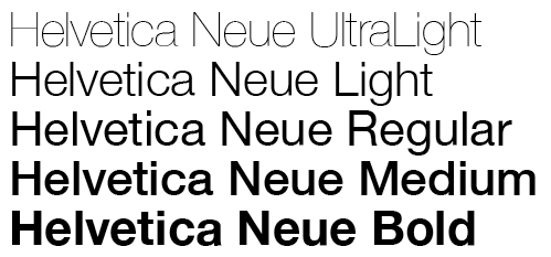
1.BOLD letter lines are heavier (stand out)
2. Italic letters have a slight lean to the right (generally considered to be subtle and classy looking) 3.Underline is not used very often on CD covers - the text is more likely to be in a box of colour instead. 4. You can also stretch fonts or change the space (kerning) between letters to give a different appearance or weight. |
|
| cd_cover_typography_sheet.pptx |
|
Task 4:
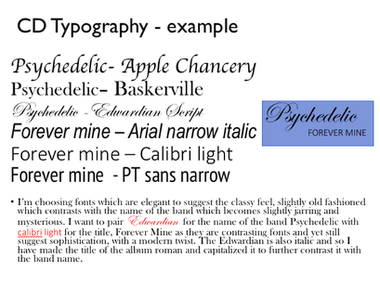
Green (grade 1-3) Select at least 3 suitable fonts for the name of your band (consider the genre) Select 3 fonts for the name of the album. (these will probably be plain san serif fonts.) Amber (grade 4-5) |
|

|

|

|
|
|
|
|
|
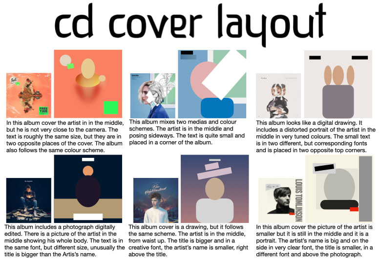
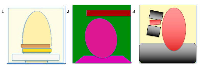
Green (grade 1-3) Simplify 2 or 3 different album covers from my chosen examples. Amber (grade 4-5) Simplify 3 different album covers (these can be a mixture of my examples or ones of your own choosing which fit your music genre) |